In my capacity as graphic designer for Campus Auxiliary Services at SUNY Geneseo, I dealt directly with digital signage throughout the dining locations on campus.
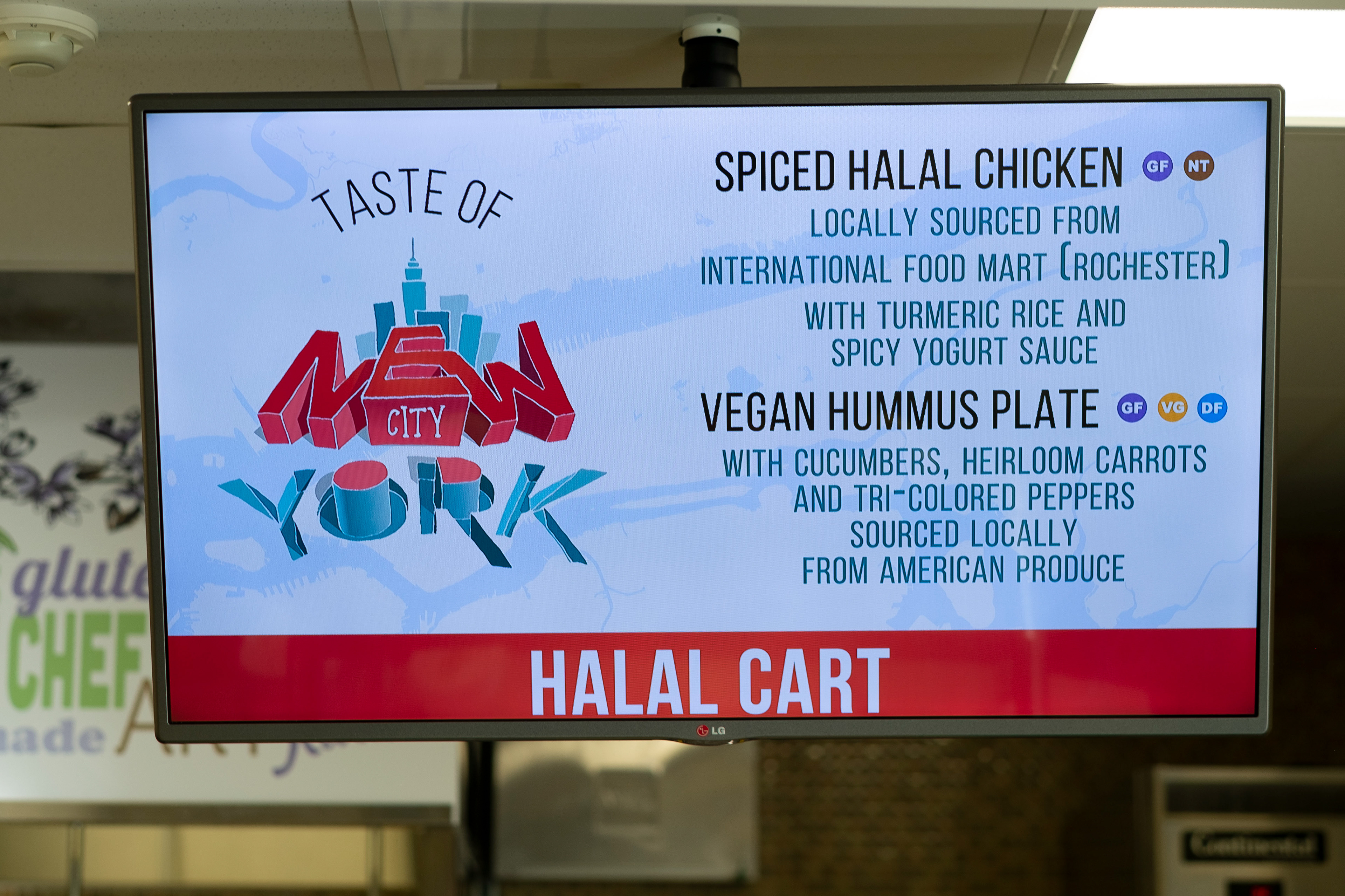
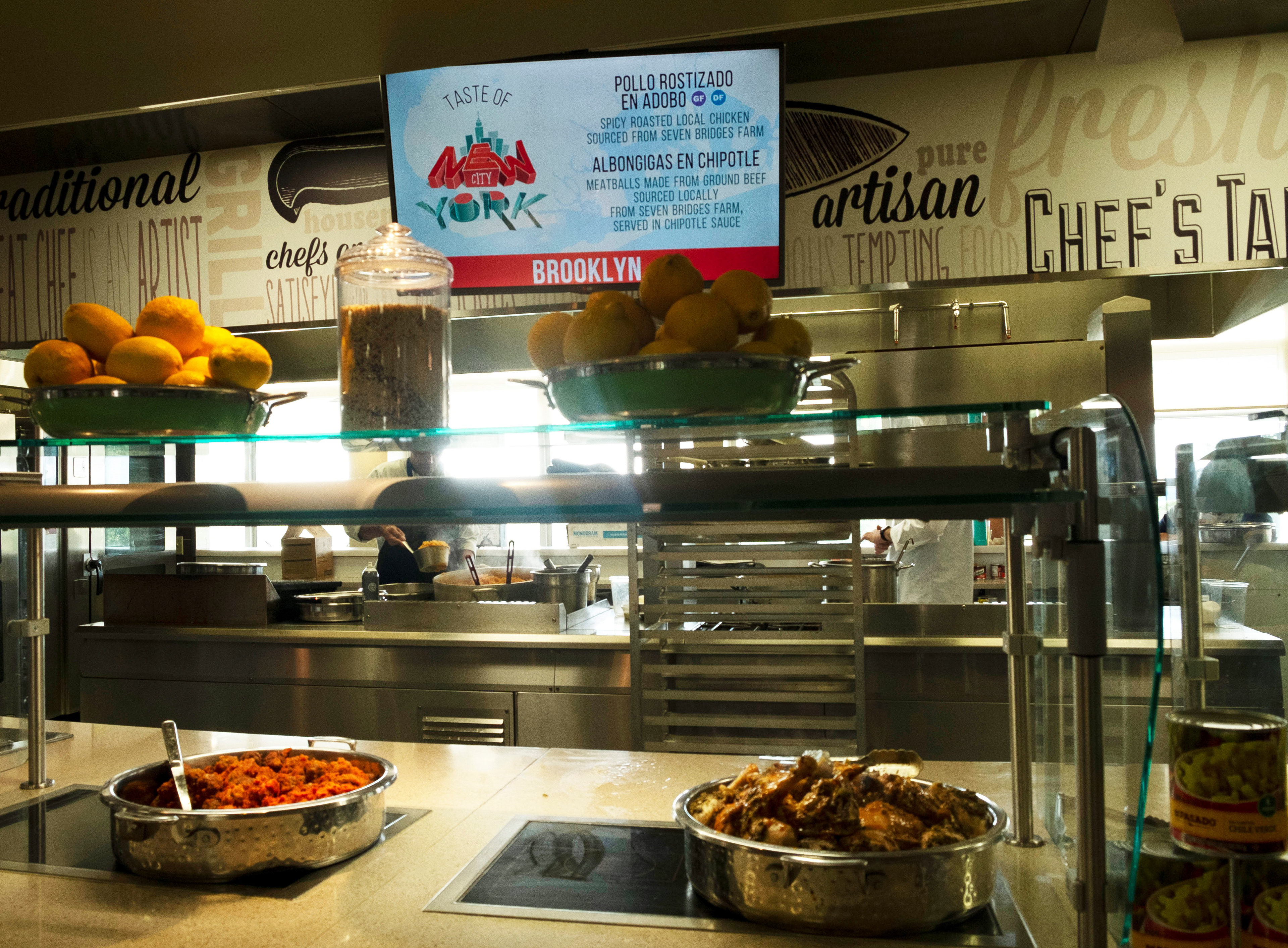

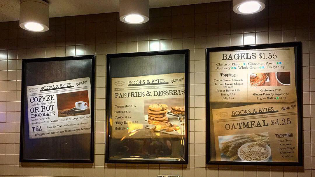
These pictures show the digital signage for a special event, "Taste of New York City." Each of the images on these screens is a JPEG - a pre-composed static image. Each JPEG had to be manually scheduled to the screen for the duration it was supposed to play.
So, for a dining location that is on a 3-week rotation (meaning, there are 21 different days of food and signage content, then the cycle repeats), we had to individually schedule 21 different JPEGs to every screen.
To make matters worse, our screen scheduling software (FourWinds) wouldn't allow us to automate these cycles - so, every three weeks, I had to go back in and individually reschedule every day of content for another recurrence, for every screen with menu content that changed daily or more (which accounted for at least 15 different screens across campus).
The other issue with this approach was making edits to content on the screens. If the JPEG had been exported with incorrect information, I would have to open back up the project file for that station's screens, find the correct screen from the 21 within that file, make the edit, re-export, and then refresh FourWinds for the change to go live on the screen. This could apply to even more screens across campus, including dining locations with relatively fixed menus (per semester) that required occasional menu edits due to specials or ingredient shortages.
In summer 2019, members of the Campus Auxiliary Service marketing and IT teams spoke with FourWinds representatives about ways that we could improve this system. The solution? Live data display. Instead of requiring a separate JPEG for every separate set of information we wanted to display on a screen, we could set up an Excel sheet with all the information, and use some custom code in FourWinds to automatically display the Excel sheet's data on the screen, on the correct day and time and with minimal intervention throughout each semester.
I worked directly with FourWinds' team to help support our transition to this new method. This took a lot of work to determine how to maintain our old visual design standards, using a new interface. Eventually, we arrived at workable results.
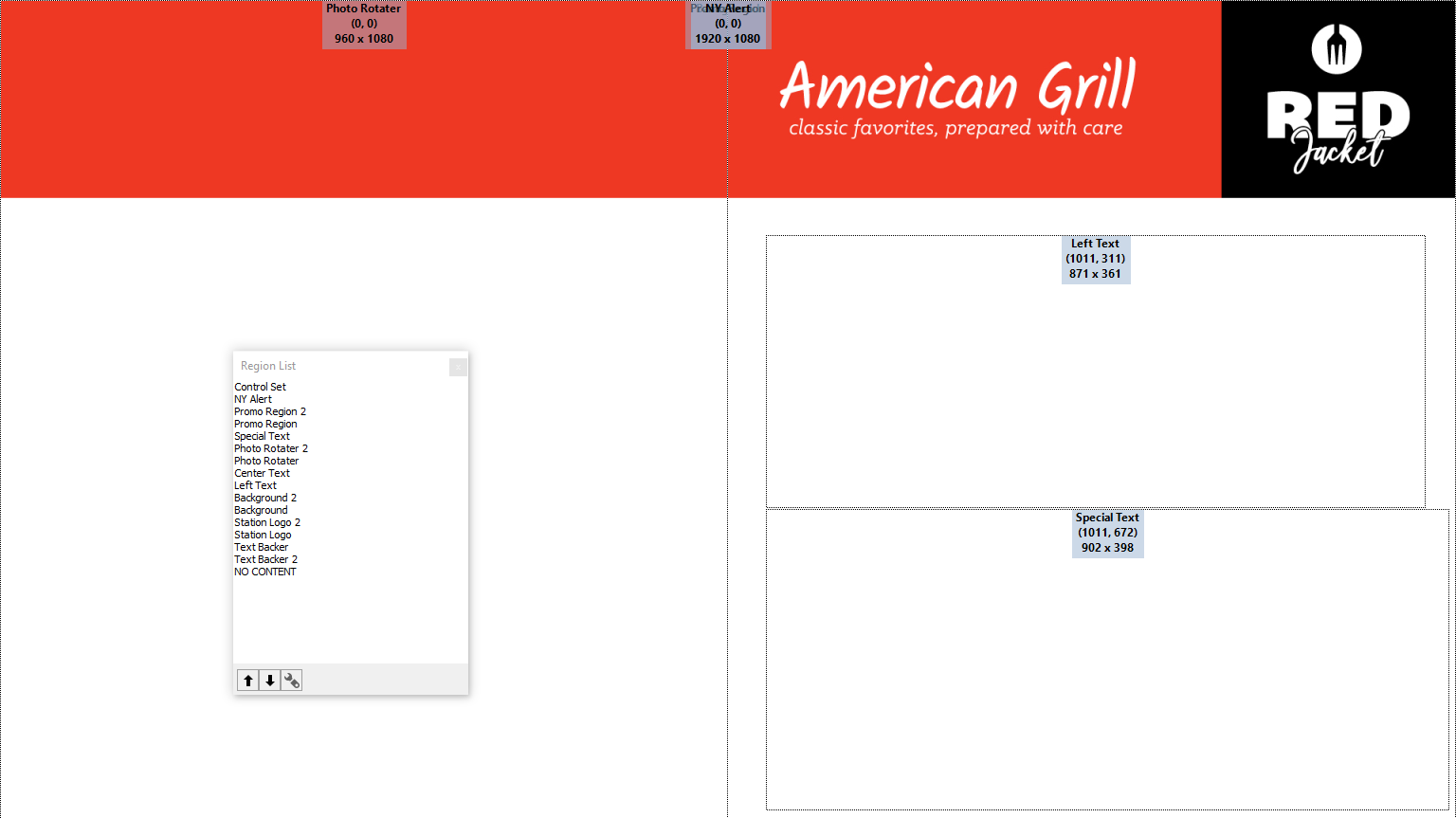
On the left is a picture of the published screen, as it would appear on the TV hanging over the food station. (The GF, DF and VG stand for gluten-free, dairy-free and vegan, which was explained elsewhere in each dining location for customers' sake.) On the right is how the "template" for the screen is set up within FourWinds. Note the different "regions" - the Photo Rotater that brings in a slideshow of images on the left, the Left Text and Special Text boxes that receive content from the Excel sheet, and various other regions that are not being used.

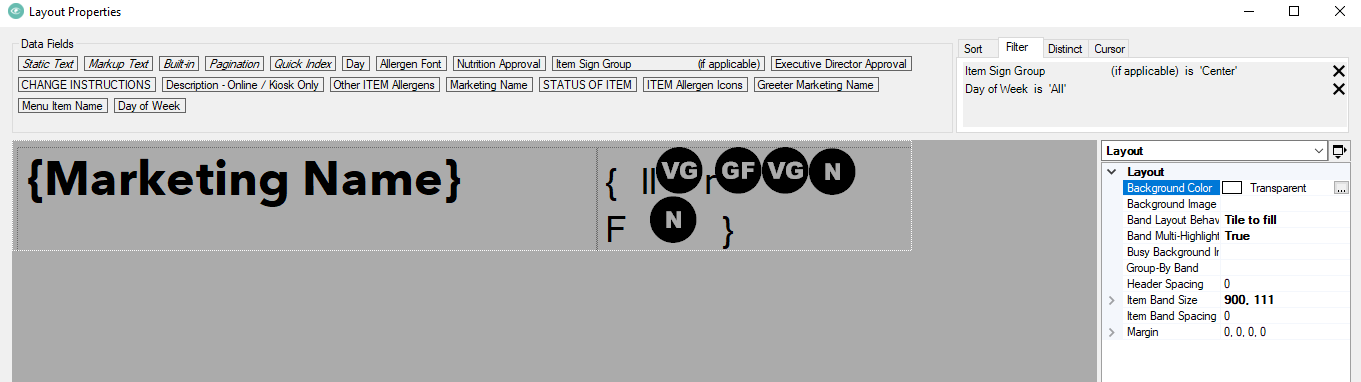
This is the panel (in FourWinds) where the content is actually brought in from FourWinds. The content in Column B in the first image ("Marketing Name") displays in the area with that name in the "Layout Properties" panel in the second image. In the top-right corner of the second image, you can see the filters that have been applied to make sure the text displays on the "Center" screen, and that it cycles through "all" the days of the week.
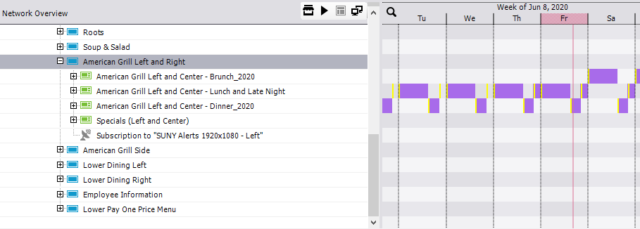
This is a view of the scheduling. On a given Friday, the menu alternates between a "Lunch and Late Night" template, and a "Dinner" template. On Saturday, a "Brunch" template is also active. This scheduling has to be set for every screen, but unlike in the past, the scheduling can basically be done once at the start of the semester (as opposed to several hours of work every three weeks), and any changes to content can be made as edits within the Excel sheet, as opposed to exporting out new JPEGs.
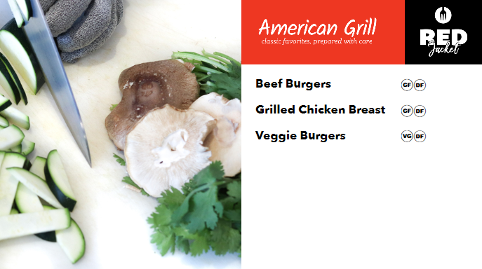
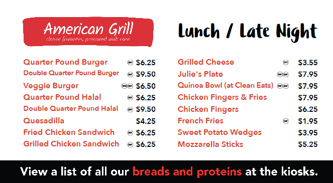
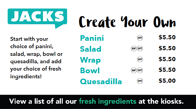
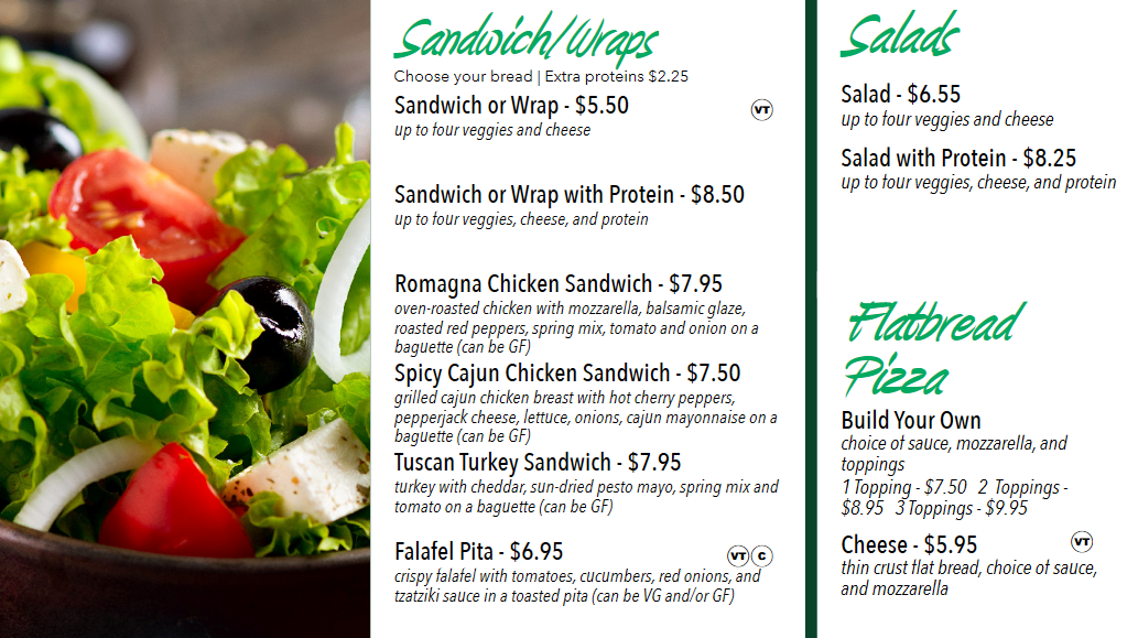
Some examples of my design of live data-displaying digital screens using this system (compared to the JPEGs on the screens we saw earlier, these are actively receiving data from Excel spreadsheets that can be modified and updated on the fly without extensive re-design):

This was my demonstration of my experience working through problems and implementing new solutions for Campus Auxiliary Services' digital signage displays.
Thank you for reading, and please reach out if you have questions or feedback on my approach!